Vanilla Frontend Challenge is a weekly challenge to build UI components with HTML, CSS and Javascript the vanilla way!
View all the challenges in GitHub
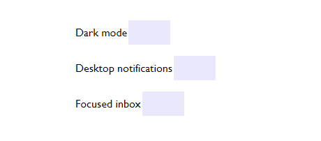
Goal:
- Create a custom toggle switch
- Create a custom radio button
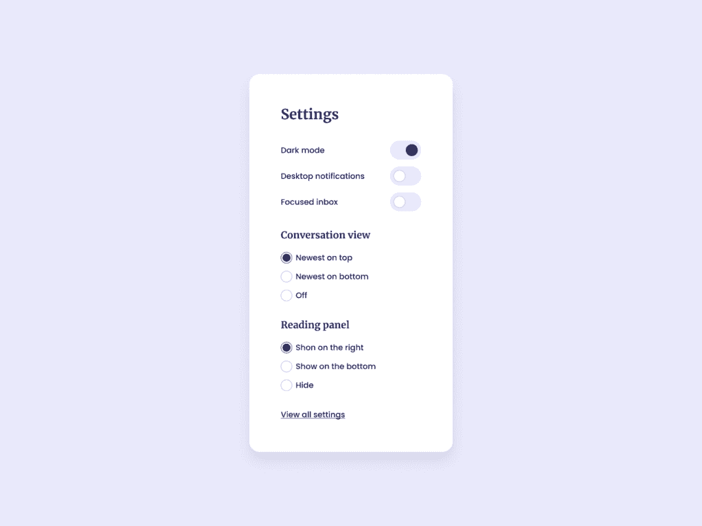
UI designed by UI Design Daily
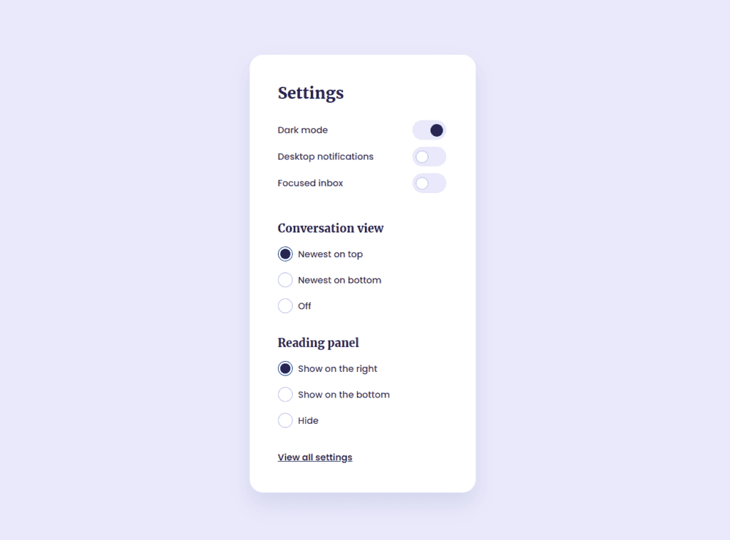
Output:
Learnings:
How to create a custom toggle switch?
A toggle switch is used in websites or apps to allow users to enable or disable some settings.
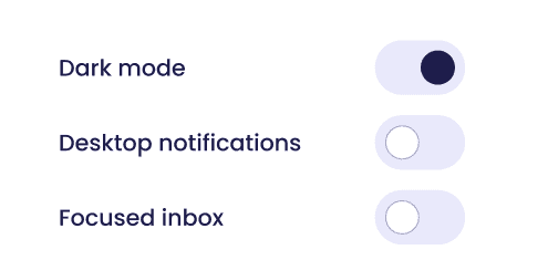
This is our goal:
This tutorial is base on W3Schools' How to Create a Toggle Switch
In the example, it's using an <input> element with type="checkbox".
First, let's create the HTML:
<div>
  <p>Dark mode</p>
  <label class="switch">
    <input type="checkbox" checked>
    <span class="slider round"></span>
  </label>
</div>
<div>
  <p>Desktop notifications</p>
  <label class="switch">
    <input type="checkbox">
    <span class="slider round"></span>
  </label>
</div>
<div>
  <p>Focused inbox</p>
  <label class="switch">
    <input type="checkbox">
    <span class="slider round"></span>
  </label>
</div>
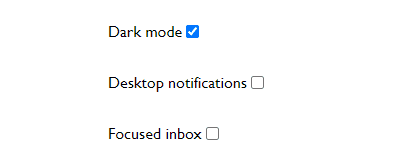
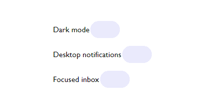
By default, it looks like this:
In our CSS, the first thing we need to do is hide the checkbox:
.switch input {
  opacity: 0;
  width: 0;
  height: 0;
}
This can also be done by just using appearance: none.
Create the slider:
The slider is the background of our toggle switch.
/* Slider toggle */
.switch {
  position: relative;
  width: 60px;
  height: 35px;
  margin: 2px;
}
.slider {
  position: absolute;
  cursor: pointer;
  top: 0;
  left: 0;
  right: 0;
  bottom: 0;
  background-color: #E9E9FB;
  border-radius: 34px;
}
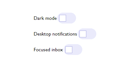
Create the circle:
To create a the circle, we need the pseudo-element before to create an additional content. It's important to add a height and a width to actually create the content.
Note: using :after still produces the same output, at least in this example.
.slider:before {
  position: absolute;
  content: "";
  height: 20px;
  width: 20px;
  left: 6px;
  bottom: 6px;
  background-color: #fff;
  border: 1px solid #A4A4DF;
}
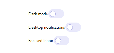
Add border-radius to make it into a circle:
.slider:before {

  ...
  border-radius: 50%;
}
We want that when it's clicked, the circle goes to the right side like this:

To achieve that, we'll need to transform the circle using CSS function translateX(). It's used for repositioning an element horizontally (X-axis).
input:checked + .slider:before {
  -webkit-transform: translateX(26px);
  -ms-transform: translateX(26px);
  transform: translateX(26px);
  background-color: #1E1D4B;
  border: 1px solid #1E1D4B;
}
Let's breakdown the code above first.
What does + mean?
The plus (+) sign is a CSS selector which means "I'm referring to the element right after an element"
To make it clearer, let's see another example:
HTML:
<p class="apple">Apple</p>
<p class="orange">First Orange</p>
<p class="orange">Second Orange</p>

CSS:
.apple + .orange {
  color: orange;
}
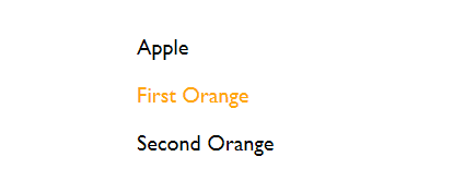
From the code above, both the First Orange and Second Orange has a class="orange" but only the First Orange's color changed. That's because it's the first element immediately after(+) the apple.
What does input:checked mean?
It translates to does the element have an attribute checked?
<input type="checkbox" /> // input:checked ? nope
<input type="checkbox" checked /> // input:checked ? yes
The .slider:before is treated like an additional element.
To combine the whole CSS code, it means:
"If the element has an attribute checked (which happens when it's clicked), I want the .slider:before element to have the following CSS styles..."
What does transform: translateX() mean?
The translateX() is a CSS function that repositions an element horizontally.
In our code, it will move the circle (.slider:before) 26 pixels away from it's current position in a horizontal direction and to the right.
To the right because the pixels value is positive. If you put translateX(-26px), the circle will move to the left.
And also we want to change its color.
background-color: #1E1D4B;
border: 1px solid #1E1D4B;
To make the circle not move too fast, we just need to add a transition duration:
.slider:before {
  ...
  -webkit-transition: .4s;
  transition-duration: .4s;
}
The only thing left now is to make the slider positioned aligned to the right of our layout.
div {
  display: flex;
  justify-content: space-between;
  align-items: center;
  width: 300px;
}
Here's the full CSS:
/* Slider toggle */
.switch {
  position: relative;
  display: inline-block;
  width: 60px;
  height: 35px;
  margin: 2px
}

.switch input {
  opacity: 0;
  appearance: none;
  width: 0;
  height: 0;
}

.slider {
  position: absolute;
  cursor: pointer;
  top: 0;
  left: 0;
  right: 0;
  bottom: 0;
  background-color: #E9E9FB;
  border-radius: 34px;
}

/* Circle */
.slider:before {
  position: absolute;
  content: "";
  height: 20px;
  width: 20px;
  left: 6px;
  bottom: 6px;
  background-color: #fff;
  border: 1px solid #A4A4DF;
  border-radius: 50%;
  -webkit-transition-duration: .4s;
  transition-duration: .4s;
}

/* This moves the circle to the right */
input:checked + .slider:before {
  -webkit-transform: translateX(26px);
  -ms-transform: translateX(26px);
  transform: translateX(26px);
  background-color: #1E1D4B;
  border: 1px solid #1E1D4B;
}

How to create a custom radio button?
A radio button is used in forms where only one of the options must be selected by the user.
To create a radio button, we just need an input element with type="radio"
<input type="radio" name="options" />
<label for="html">Option One</label><br>
<input type="radio" name="options"/>
<label for="html">Option Two</label>
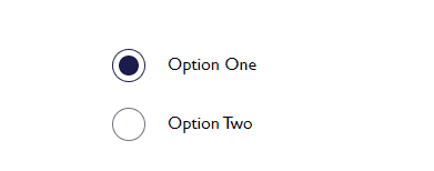
By default, a radio button looks like:

It's a tiny gray circle and when clicked, it turns into blue, both the outline and the filled circle inside.
After I built the custom radio button, I found out that there's actually a CSS property to change a radio button's color when clicked. It's called accent-color. Tried it and this is how it looks:
input[type="radio"] {
 width: 30px;
 height: 30px;
 accent-color: #1E1D4B;
}
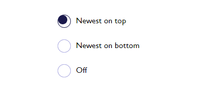
This is what we want to achieve:
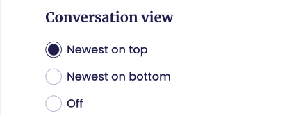
Comparing the two, you'd notice that the in our goal, the unclicked radio button is purple-ish. Also the space between the outline and the filled circle inside is much smaller than with the regular radio button.
I haven't found any resources to allow us to change the color of an unclicked radio button and the adjust the spacing with existing CSS properties.
So customizing is the answer.
First, we need the HTML.
<div>
  <input type="radio" checked id="convo-view-1" name="convo-view" value="Newest on top">
  <label for="convo-view-1">Newest on top</label>
</div>
<div>
  <input type="radio" id="convo-view-2" name="convo-view" value="Newest on bottom">
  <label for="convo-view-2">Newest on bottom</label>
</div>
<div>
  <input type="radio" id="convo-view-3" name="convo-view" value="Off">
  <label for="convo-view-3">Off</label>
</div>
It's important to note that all of the inputs should have the same name attribute as this is the basis that they're of the same group, meaning that if the user clicks on another radio button, it will un-select the previously selected one.
First, we need to hide the default radio button styling with appearance: none;
div {
  display: flex;
  align-items: center;
  margin-bottom: 20px;
}

/* Radio button */
input[type="radio"] {
  appearance: none;
  -webkit-appearance: none;
  -moz-appearance: none;
  cursor: pointer;
  margin-right: 10px;
}
Create the outline:
input[type="radio"] {
  background-color: #fff;
  width: 26px;
  height: 26px;
  border: 1px solid #A4A4DF;
  border-radius: 50%;
}
Create the filled circle:
input[type="radio"]:checked::after {
  position: absolute;
  content: "";
  width: 18px;
  height: 18px;
  background-color: #1E1D4B;
  border-radius: 50%;
}
We only want so show the filled circle inside when the radio button is clicked, which will give it an attribute of checked.
We use the pseudo-element ::after to create the circle. After is used for adding a content after an element. In this case, we want to create a circle.
It's important to add the position:absolute so our circle is positioned relative to it's parent, the input element. And give it both width and height of equal size to make it a square at first:
Then add a border-radius to turn it into a circle. Now it looks like this.
To put it in the center, I added a padding to our input.
input[type="radio"] {

  ...
  padding: 3px;
}
Another alternative is to adjust the position with top and left properties of the ::after element:
input[type="radio"]:checked::after {

  ...
  top: 7px;
  left: 9px;
}
Choose which you think is best for you.
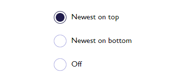
Here's the full CSS:
div {
  display: flex;
  align-items: center;
  margin-bottom: 20px;
}

/* Radio button */
input[type="radio"] {
  appearance: none;
  cursor: pointer;
  margin-right: 10px;
}

input[type="radio"] + label {
  cursor: pointer;
}

input[type="radio"] {
  background-color: #fff;
  width: 26px;
  height: 26px;
  border: 1px solid #A4A4DF;
  border-radius: 50%;
  padding: 3px; /* option 1 to center the circle */
}

input[type="radio"]:checked {
  border-color: #1E1D4B;
}

input[type="radio"]:checked::after {
  position: absolute;
  content: "";
  top: 7px; /* option 2 */
  left: 9px;
  width: 18px;
  height: 18px;
  background-color: #1E1D4B;
  border-radius: 50%;
}
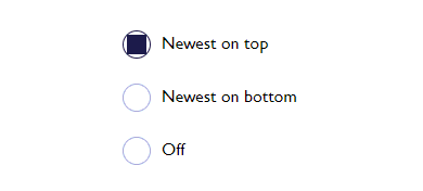
This is the final output:
Resources for further reading:
Want to do the Vanilla Frontend Challenge? Share it in the comments!
All the code is in GitHub.