Vanilla Frontend Challenge is a weekly challenge to build UI components with HTML, CSS and Javascript the vanilla way!
View all the challenges in GitHub
Goal:
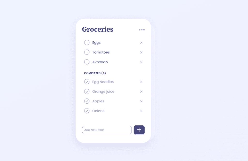
- Add a new item to the list
- Update the not done items' name
- Delete each item from both not done and done list
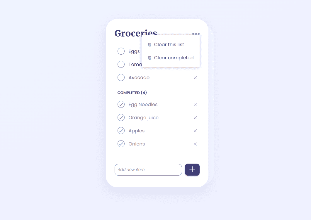
- Clear completed list
- Clear all list
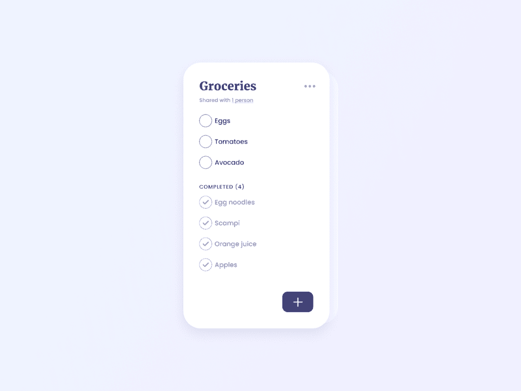
UI designed by uidailydesign.com
Output:
Learnings:
How to add a CSS drop shadow effect?
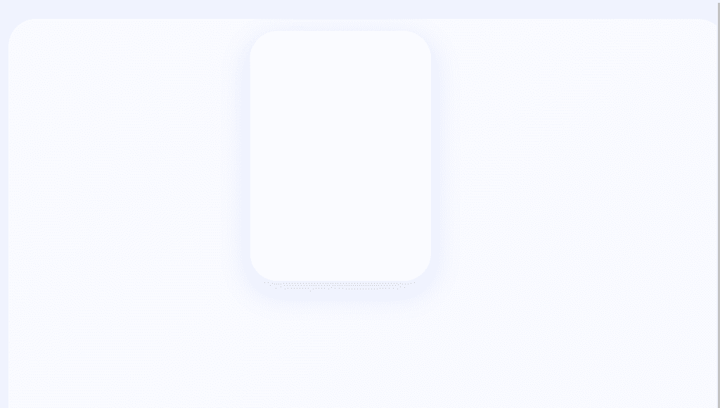
The goal drop shadow effect:
HTML:
<div class="container">
  <div class="card-container">
    <div class="shadow"></div>
    <div class="card">
      <div class="card-content"></div>
    </div>
  </div>
</div>
The first thing we need is a background color to make our card and drop shadow stand out. In this case, I'm using a linear-gradient.
body {
 height: 100vh;
 background-color: #EEF5FF; // fallback color
 background-image: linear-gradient(to bottom right, #EEF5FF,#F0EEFF);
}
Card CSS:
.container {
  padding: 50px;
  display: flex;
  justify-content: center;
}

.card-container {
  position: relative;
}

.card {
  width: 200px;
  height: 300px;
  padding: 30px;
  box-shadow: 0px 15px 41px 3px #B4B4E34D;
  border-radius: 40px;
  background-color: #fff;
  position: relative;
}
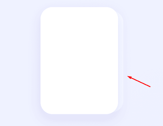
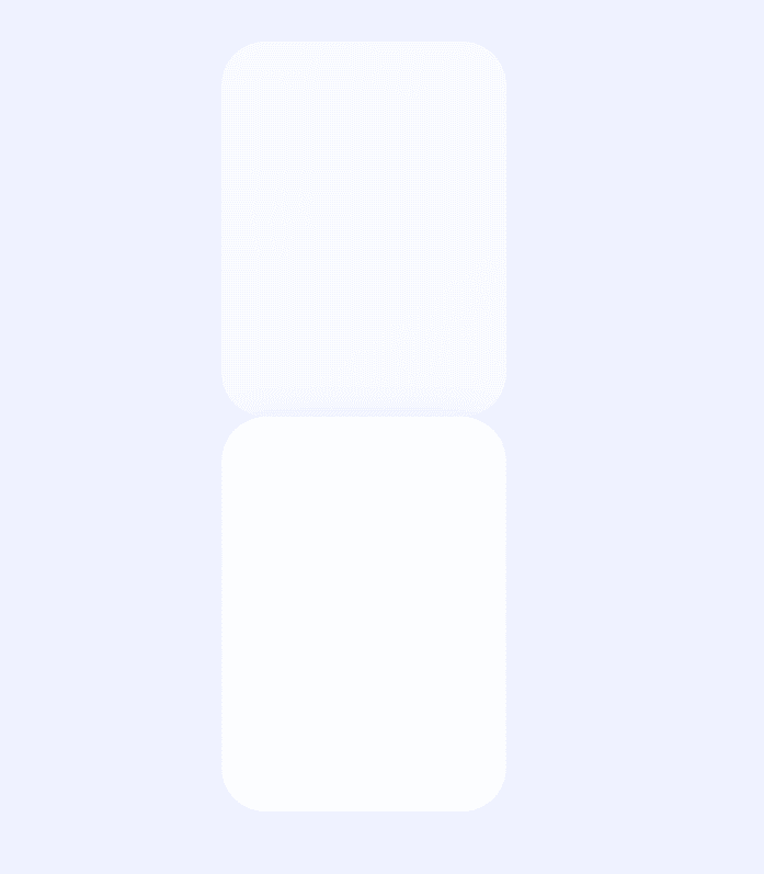
Without position: relative on the card-container, it will look like this:
Shadow CSS:
.shadow {
  position: absolute;
  width: 100%;
  height: 95%;
  bottom: 8px;
  right: -14px;
  border-radius: 40px;
  background-color: #ffffff99;
}
We need position: absolute for our shadow effect so it will be positioned relative to the card-container. Otherwise, it will look like this:
Other things to note: background-color: #ffffff99 is equivalent to:
background-color: #ffffff;
opacity: 0.6; // 60%
To learn how to set hex color values with opacity, visit this gist Hexadecimal color code for transparency by Lopez Mikhael.
How to create rounded checkbox?
By default, a checkbox will look like this:
<input type="checkbox"/>

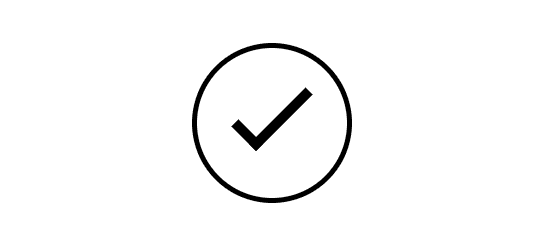
Our goal checkbox is this:
This is based on a custom rounded checkbox by Matt Smith. Click the link for the codepen snippet.
HTML:
<div class="round">
  <input type="checkbox" />
  <label></label>
</div>
CSS:
Creating the circle:
.round label {
  background-color: #ffffff;
  border: 1px solid #000000;
  border-radius: 50%;
  height: 30px;
  width: 30px;
  position: absolute;
  cursor: pointer;
}
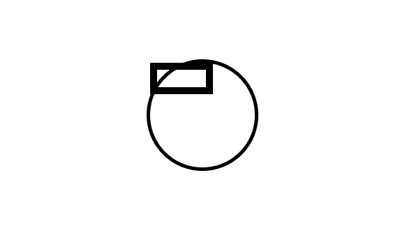
Set the height and width of the label with the same values so they're proportional. Give it a border-radius of 50% to make it circular. Make sure to set the position as absolute, otherwise, it will look like this:

Creating the check icon:
Before we proceed to the actual check icon, let's see the basic properties first.
.round label:after {
  border: 2px solid #000000;
  position: absolute;
  content: "";
  height: 5px;
  width: 14px;
}
Using a pseudo element ::after lets us add an additional content to an element, as its last child. In this case, a content of "" (empty string) is added. Then we add it a height and width properties to recreate a rectangle.
Now, to create the check icon, all we have to do is remove top and right border of the rectangle.
.round label:after {
  ...
  border-top: none;
  border-right: none;
}
So it looks like this now:
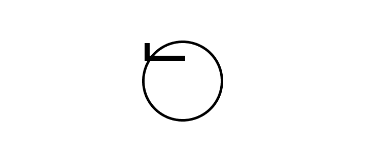
Now, just adjust the position to make it go to the center and rotate the inverse "letter L" to look like a check.
.round label:after {
  transform: rotate(-45deg);
  top: 9px;
  left: 7px;
}
It now looks like a rounded checkbox:
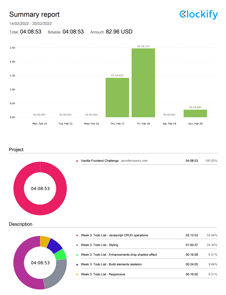
Time Report:
Total development time: 4:08:53
Resources for further reading:
Want to do the Vanilla Frontend Challenge? Share it in the comments!
All the code is in GitHub.