Goal:
HTML:
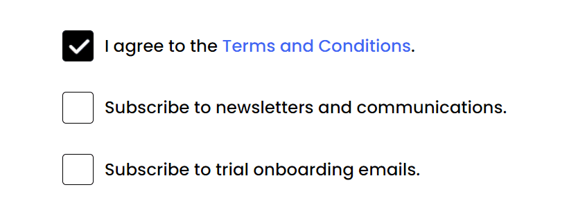
<ul class="options">
  <li>
    <div class="checkbox">
      <input type="checkbox" checked id="option-1">
      <label for="option-1"></label>
    </div>
    <span>I agree to the <a href="#" class="links">Terms and Conditions</a>.</span>
  </li>
  <li>
    <div class="checkbox">
      <input type="checkbox" id="option-2">
      <label for="option-2"></label>
    </div>
    <span>Subscribe to newsletters and communications.</span>
  </li>
  <li>
    <div class="checkbox">
      <input type="checkbox" id="option-3">
      <label for="option-3"></label>
    </div>
    <span>Subscribe to trial onboarding emails.</span>
  </li>
</ul>
CSS:
First, we need to hide the default design of the input checkbox.
input[type="checkbox"] {
  appearance: none;
}
Designing the unchecked box:
.checkbox label {
  background-color: #fff;
  border: 1px solid #000;
  cursor: pointer;
  position: absolute;
  border-radius: 3px;
  height: 26px;
  width: 26px;
}
What we're actually doing here is just designing the <label> element. We will only use the <input> element as the basis to know if our checkbox is checked or not through it's attribute checked. The checked attribute is toggled when the checkbox is clicked.
Adding the custom icon:
.checkbox input:checked + label {
  background-color: #000;
  background-image: url('./images/checkbox.png');
  background-position: center;
  background-repeat: no-repeat;
  background-size: 22px;
}
The .checkbox input:checked + label translates to "Is the checkbox checked? If yes, then I want to apply the following CSS properties to the element <label> immediately after the input element"
We're both adding a background color of #000 (black) and a background image, which is our icon.
Adjust the background position and background size according to the image you're using.
Also, make sure that you have the correct url. You can use a relative path, like the example above which means that your image is right inside your source code or you can opt to use a link to an image.
That's it.
Here's the full CSS:
ul li {
  list-style: none;
  display: flex;
  align-items: center;
  padding: 15px 0;
}

.options span {
  margin-left: 35px;
}

input[type="checkbox"] {
  appearance: none;
}

.checkbox label {
  background-color: #fff;
  border: 1px solid #000;
  cursor: pointer;
  position: absolute;
  border-radius: 3px;
  height: 26px;
  width: 26px;
}

.checkbox input:checked + label {
  background-color: #000;
  background-image: url('./images/checkbox.png');
  background-position: center;
  background-repeat: no-repeat;
  background-size: 22px;
}

a {
  text-decoration: none;
}